SuperAstro
AI Astrology Chat app | Product & Motion Design
Overview
Astrology apps in India largely follow the same pattern: dark themes, dense reports, mystical language, and aggressive paywalls that appear before users understand the value. For Gen‑Z users, this creates friction and distrust.
SuperAstro was conceived to challenge this pattern by answering one question:
What if astrology felt like an ongoing conversation with someone you trust?
This project documents how we designed and launched SuperAstro as a chat-first product, where UX, copy, and monetization are tightly integrated
Problem Definition
Logo & Visual Identity Exploration
Concept Direction
While exploring the visual language for SuperAstro, we identified two recurring metaphors commonly used in astrology products:
Stars — representing mystery, guidance, destiny, and the timeless idea of reading the stars
Orbits — symbolising planetary motion, relationships, and time-based transitions in astrology
We intentionally leaned into these metaphors to ensure the brand felt rooted in astrology, while still allowing room for a modern interpretation.


Animations made with Rive
Core Product Decision: Chat‑First Experience
SuperAstro is designed around a single primary surface: chat.
Onboarding happens inside chat
Insights are delivered message-by-message
User intent is built progressively
This reduced cognitive load and allowed us to control pacing, tone, and emotional buildup.

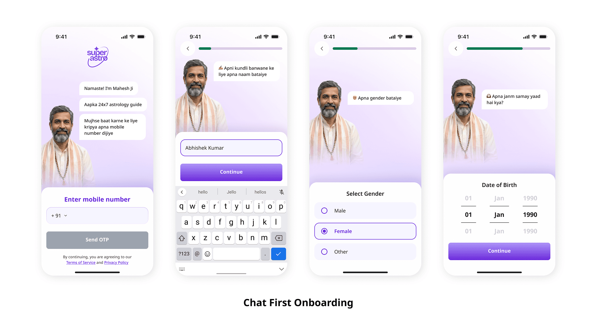
But why Chat Based Long Onboarding?
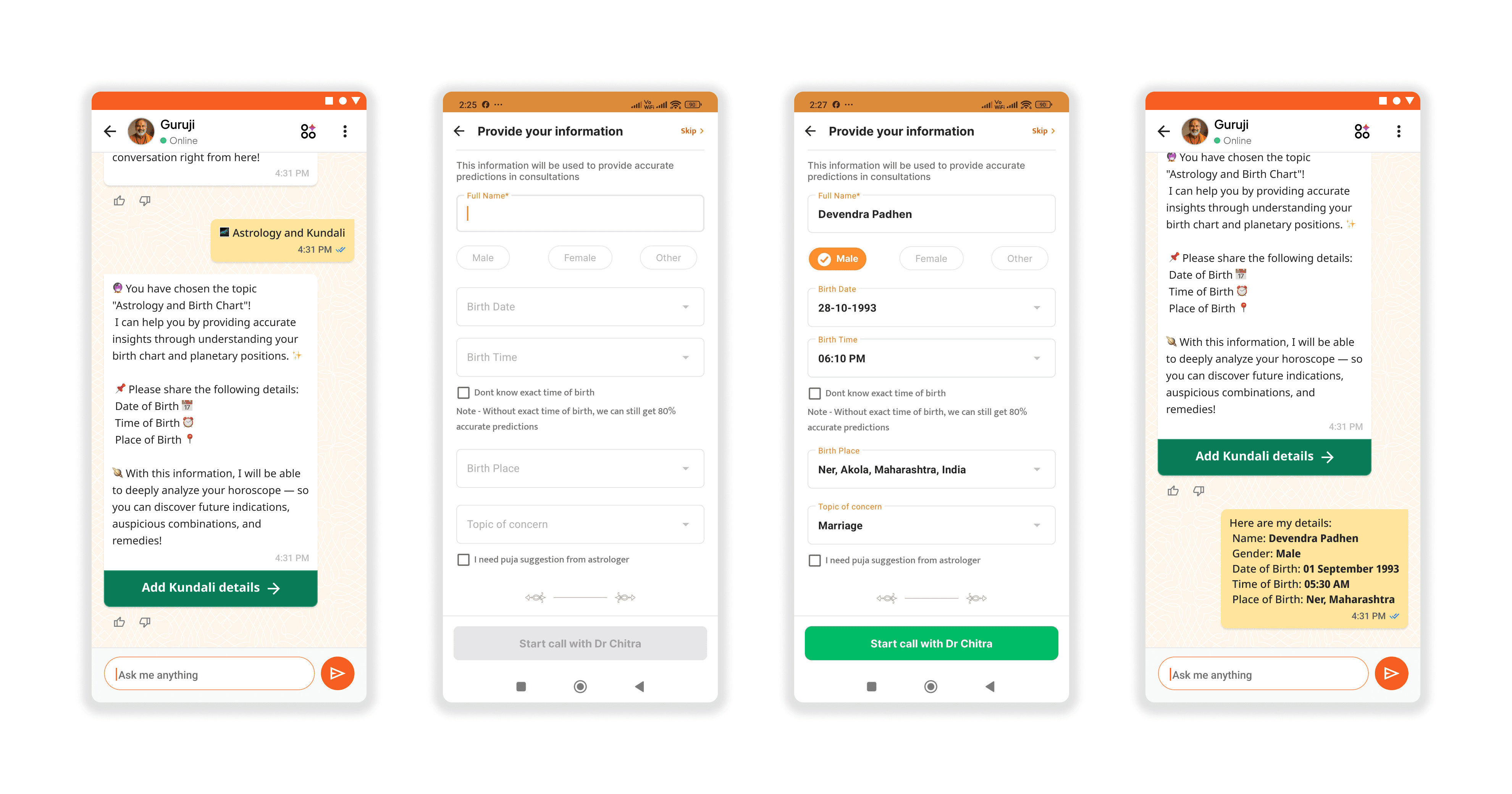
Taking the learnings from our intial AI Guruji experiement on the Sri Mandir app, we knew that presenting a direct form to the users we could just make the process feel lighter and conversation in nature by dividing it in steps and adding context to each step.
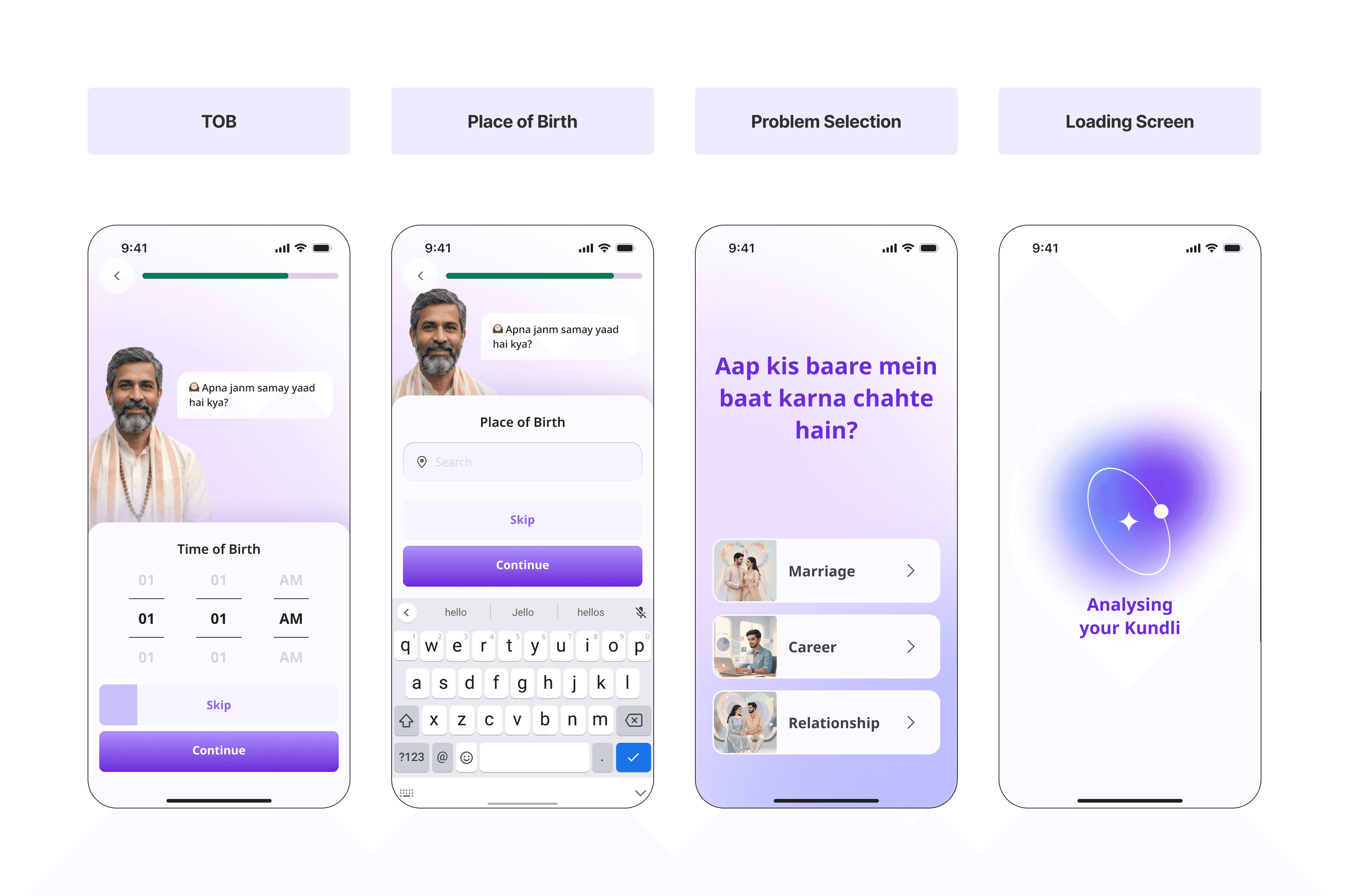
The Cliffhanger

Paywall Design & Experimentation
SuperAstro introduces monetization before the trial begins, during the login/signup flow. This moment is high-intent but low-trust, users are curious, yet cautious.
Instead of using a single paywall, we designed three paywall variants for the Login to Trial funnel, each aligned to a different user mindset: urgency, clarity, and trust.
All variants communicate the same offer (₹1 trial → ₹149 autopay after 24 hours), but differ in how the value is framed.


Persona‑Driven Guidance
Instead of a single generic astrologer, we introduced four distinct personas, each designed around a specific emotional need:
Mahesh Maharaj - Warm, elder‑brother figure (relationships, anxiety)
Acharya Vinod - Authoritative Vedic expert (career, family matters)
Tara - Modern Gen‑Z bestie (dating, self‑discovery)
Savitri Ji - Grandmother figure (health, household peace)

Experiments
Early renewal - Usage limits for trial users

Our ₹1 trial successfully drove sign-ups, but it exposed an unintended business problem.
A significant number of trial users were consuming a large volume of AI conversations before cancelling their subscription. These users generated the highest infrastructure costs while contributing the least revenue, making the trial increasingly unprofitable.
When I analyzed the first 24 hours of user behavior, a clear pattern emerged: higher engagement was strongly correlated with higher cancellation rates. Users sending over 80 messages cancelled at a rate of 73.6%, indicating that many had already extracted enough value before ever encountering a compelling reason to subscribe.
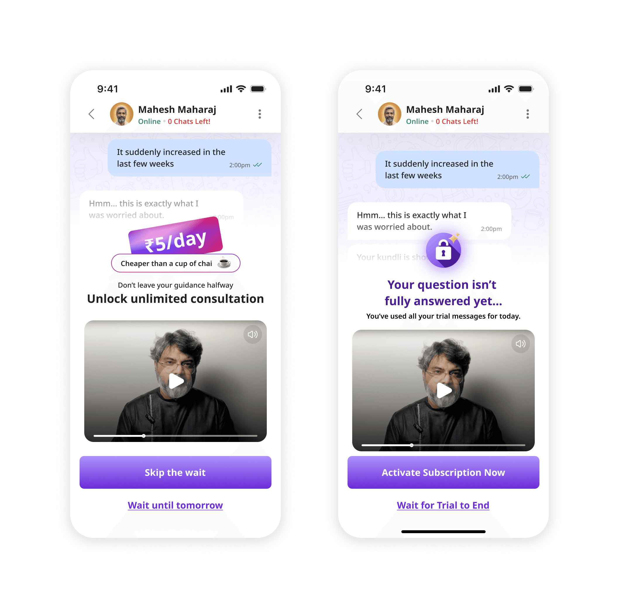
Instead of abruptly blocking access, the experience introduced a gradual countdown as users approached the free usage limit.

To create additional upgrade opportunities, only a subset of AI personas remained available during the trial. Premium personas were locked behind the subscription, allowing users to explore the product while still highlighting the value of upgrading.

The experiment successfully shifted subscription decisions earlier in the user journey.
By introducing the paywall while users were still actively engaged, we reduced value leakage during the ₹1 trial and increased trial-to-paid conversions. At the same time, the solution lowered token consumption from users who previously exhausted the trial before cancelling, improving the overall economics of the subscription funnel.
We also tried 2 virations in A/B test for the early renewal paywall and by improving the messaging the paywall and showing the per day rate for the users, we saw the good increase in the early renewal numbers.
Widgets - retention experiments
We had analysed 4k+ chat sessions across top users to understands power user patterns. This set of experiments was an attempt to productise these power user patterns for all users and see how this affects - conversion, retention and engagement
Most users didn’t know what to ask.
We needed to create lightweight entry points that naturally pulled them back into chat.

*Note: The Astrochakra was completly made with with rive, the interactions with audio everything handled using databinding.
Read More about it: Click Here

Introducing the new widget feature to users through chat,

Introducing the Coin System
The app had users who felt like regulars at a café, back every day, same order, deeply invested. And users who wandered in once, looked around, left. Both paid the same price.
That asymmetry was leaving money on the table. Worse, the subscription model actively worked against retention: the moment a payment lapsed, access cut off, even if the user had every intention of continuing. We were penalizing hesitation instead of rewarding habit.

Top-up packs were designed to show explicit bonus value — not just a number, but the delta. A badge showing "+X% extra coins" anchors the perceived deal.

What We Designed
The system touched nearly every screen in the app. Key design areas:
A dedicated wallet page with prominent coin balance and message equivalence. Transactions split into two tabs: Coins (earned, spent, source) and Money (real payments). This separation reduced confusion between "my plan expired" and "my access expired."


We mapped out every user state combination: trial with active mandate, trial with suspended mandate, subscribed with active/cancelled mandate, and zero-balance scenarios. Each had its own UI state, copy, and CTA hierarchy.

A non-disruptive indicator near the balance (not a blocking banner) triggered when ~5 chats remained. Inside chat, a subtle tooltip hint — never a hard interrupt.


Coins should feel owned, not rented. We designed the whole system around that one idea.
Kundli GTM
To improve Kundli Report adoption, we redesigned the entire journey, from the paywall experience to report consumption and chat engagement.
A dedicated Kundli-focused paywall was introduced to better communicate value before purchase. Instead of a generic subscription flow, users could preview key insights, understand what the report contains, and access a sample report before making a decision.

Genrating detials on the dashboard took time so we designed a delightful loader for it.

After purchase, users are welcomed with a report-generation experience and then taken to a personalized dashboard. The dashboard surfaces daily insights, current dasha information, and life-aspect summaries across love, career, money, and health.
Each insight card opens into a detailed explanation along with contextual follow-up questions. These questions act as conversation starters, seamlessly guiding users into chat for deeper, personalized guidance.

The report experience was extended beyond static content. As users explore different report sections, they receive relevant suggested questions tied to the content they are viewing, enabling them to instantly discuss specific insights with an astrologer or AI guide.

Kundli Report Design:


End of Case Study!
This was an experiment that we scaled from a small chatbot, which was on SriMandir app, to a full independent product. It was really fun working on the app and building for bharat!